
Social Butterfly
Social Media Site
Purpose
A case study on how technology can help Americans rebuild a sense of community and create new connections.
Humans are social creatures by nature.
So what happens to most people when the isolation of an extended quarantine hits? Well, everyone is different, but the CDC has discovered that you are more likely to be sick, feel anxious, and visit the emergency room at a higher rate.
Which sounds like a recipe for disaster during a pandemic.
So our team decided to research how loneliness was impacting people during the pandemic by conducting user interviews and surveys. Then we create a tool that we felt would best create opportunities for friendship.
What I Learned
Established Social Butterflies’ Brand and Voice from the ground up.
Evaluated how to best solve a social problem through UX Design.
Oversaw the front-end development of the Social Butterflies’ site.
Partnered and comprised with UI Designers to bring their project to life.

Goals
Reduced the necessary steps to join a community and amplified real-life connection by 2x.
Interpreted the data to best help users form real connections.
Launched a completely new niche brand voice that would stand out in a competitive market.
Coordinated with UI Design team to code this prototype into a working website.
Team
Taylor and Charlie were our Lead Researcher
Caty Nava was our Lead Developer
Farida and Lesedi were our UI Design.
Tools
Figma and Adobe Illustrator for Design
Google Suite and Miro for research
GitHub, Bootstrap, and Visual Code Studio for Front End Development
Timeline
Projects are complicated, but timelines help! Here is ours roughly 3 weeks of work broken down.


Constraints
Focus
This project had its unique set of distractions because there were so many competitors and human connection is a vast subject.
However, we felt that we could approach this subject with a new perceptive that could separate us from the competition and reduce the barriers of socialization.
Time
Time is a precious commodity, and that never becomes more clear than when you are coding an entire website in less than 5 days!
In order to maximize our time, we had to divide and conquer our workload and cut our scoop. So we didn’t develop every page, deciding as a team that we would rather produce a few quality pages than coding every page.
Additionally, we also prioritize the desktop instead of the mobile, since it was the focus of our stakeholders.

Research
We began by hypothesizing that people have been looking for resources and tools to connect with their current friends in a more interactive way, while still social distancing. And regardless of the pandemic, people still had the desire to make connections with new people.
In the week we utilized the methods below to understand our user’s relationship.
5 Interviews
30+ Surveys
Heuristic Evaluation & Usability Interviews
Market & Competitor research
What was our research goal?
Our research goal is to better understand how people make connections and interactive experiences virtually with other people.
What are our research objectives?
01
Previous to the pandemic, what were 18- 55 year-olds doing to connect with their friends and family?
And how had that changed with social distancing and limited physical contact?
02
What motivated these users to create new connections and friendships?
03
What tools did these users have to create new connections and friendships?
Who is our audience?

We began our research by interviewing and surveying technology literate users from the ages of 18-55 to see how the Covid-19 pandemic impact their new and current connections.

User Interviews Quotes
“It's already hard to meet new people - pandemic makes it more difficult since people don't want to meet up”
— Michael
“COVID-19 has greatly impacted how I spend time with others. I spend most of my time with co-workers.”
— Jonathan
“If were to join a new group, it would have to be something I'm passionate about”
— Mads
“Anybody who might have the same interest as I do, those are the people that I would be interested in meeting. "
—Nick
What did we learn from our interviews?
Affinity Diagram
Key Takeaway
We discovered that many people wanted to create new connections, but they were unsure about how to start.
Previously, our users would make friends in their dancing lessons or at their gym, but those options were not always available during a pandemic.
What did we learn from our surveys?

45% of users surveyed were working from home full time

80% of users surveyed stated that they didn’t look to fulfill their desire to meet new people right now

However, we noticed that the reasons half of our users didn’t look to fulfill their desire to meet new people were included:
Too difficult
Lack of motivation
Who is our users personified?
User Persona

What journey are they taking?

What did we learn from our competitors?
From this competitor analysis, while the largest competitors focused on creating groups based on similar interests and skills, few anticipate a completely virtual space.
Popular, but the site was designed for face-to-face events and not all groups had transferred to the virtual landscape.

Costs to sign up - Subscriptions were hard to cancel

Solely outdoor events and groups. Meant for more for travelers.
Leap of Faith
After analyzing the data, we had a choice.
To either pivot or make a product that could remove the barrier of social connection.
In the end, we choose to focus on the 20% of users trying to find new connections and 40% of users that had found it too difficult to make new connections. Not only did they end up being the majority, but we felt a responsibility to help even the small segment of users trying to reach out.
We also took into account that most of our interviews really wanted to have social connections focused around their hobby interests.

Define and Analyze
With our focus in mind and understanding of our segment, we finalized the user insight statements and began ideating possible features.
It should be noted that we spent the crux of this project was discussing how a user would find her hobby and group of choice.
User Insight Statement
People who are currently quarantined due to COVID-19 need to feel socially connected and engaged with family, friends and other people with similar interests in a virtual setting because with the lack of ability to meet in person, this desire for socialization has not disappeared.
How did we brainstorm solutions and features?
“I Like, I Wish, What If
What features were we prioritizing including?
01
Based on skills and interest
Although it feels a little obvious, we wanted to highlight that the connections made on this site would revolve around similar interests and skills. Since it was critical to the users we interviewed, it felt important to us and our story.
02
Chat
While video capability is critical for this site, we still wanted the chat feature to be a priority and focus of the site.
03
International Scope
This pandemic has shown us that technology can really build bridges and connect us, so we wanted this site to reflect this belief. So we wanted users to be able to create communities with anyone anywhere.
How will these features flow?
Overview of User Flow

Deep Dive
Here is the User Flow in more detail.

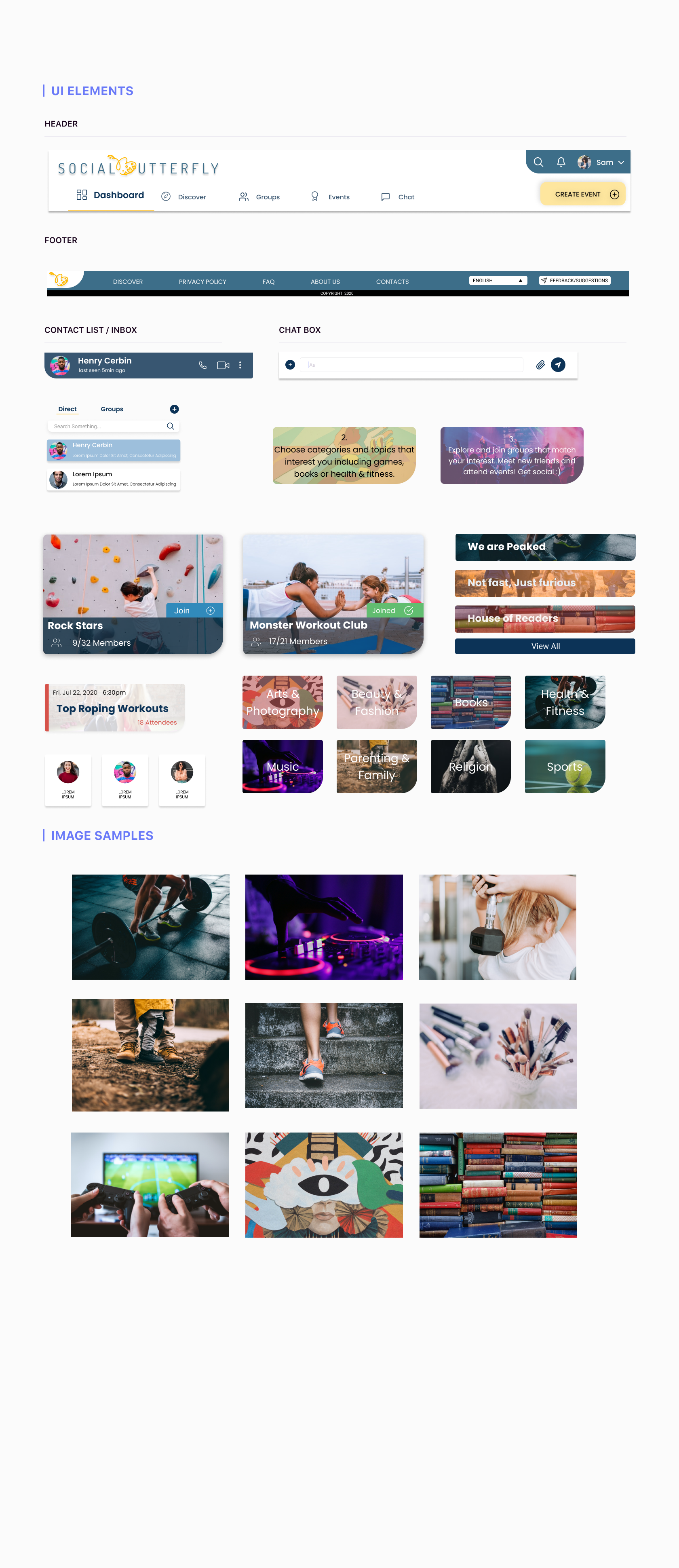
Develop & Design
Now it’s time to get creative!!
This stage was a joy to watch as we worked together to create and combines elements until we had an possible site. I believe that we were all excited to flex our creativity muscles as brainstormed in FIGMA.
What do are Wireframes look like?
Due to our limited time, we also began working on wireframes as we worked on the user flow. As the user flow solidified, we started adding more and more possible pages.
Front Page

Sign-up Page

Onboarding page - 1

Sign-up Success Page

Onboarding page - 2

What is our Brand Voice & Style Guide?
As a site dedicated to creating new connections, we were looking to create a relaxed, respectful, and enthusiastic voice.


What were the results of our usability testing?
Methodology
5 remote usability tests
Desktop lo-fi prototype
Tested how users navigate through on-boarding screens
Insights
Positive Feedback
Aesthetics and design
Clear layout, easy to understand instructions
Love the features on the dashboard: chat, calendar, etc
Constructive Feedback & Pain Points
Confusion with the account creation vs explore vs create a group
Sign up before exploring groups put users off
Hierarchy when selecting sub-groups or interests
Restrictions on # groups
Analyze & Reiteration
Through usability testing, we discovered that the onboarding process could be more clear by changing some of the language, the call to actions, as well as iterating the last step of the sign up process.

Through usability testing, we discovered that
The onboarding process could be clearer by changing some of the language, the call to action, as well as iterating the last step of the sign-up process.
The original call to action asked users to create or join a group, but usability testing showed that users expected these to be log-in and sign-up buttons. We changed these buttons to “log in” and “sign up” and moved the create and join group buttons to the bottom of the page.
We also moved the categories of interest section to the top of the page. Now, users are asked to select up to 3 interests and activities and are only presented with suggested groups when they arrive on their dashboard.
Develop
Last, but in no way the least, the Development stage!
During this stage of the process, we worked around the clock to create a high-fidelity prototype and website.
As the lead developer of the time, my main focus was on creating the layout of the page, helping the team feel comfortable using bootstrap and GitHub, and creating realistic timelines for the team.
Below were our 4/5 days of work:
Coding
Final Iterations
Final Thoughts
Future Ideas
Design & Site Walk Through
High Fidelity Walkthrough

A walk through the final prototype
Coded Website Walkthrough

A detailed video of the final coded site.
Final Thoughts
As a team, we set out to understand the implications of COVID-19 on user’s social lives. We found that while people are still craving social interactions and meeting new people, there were limited applications or platforms specifically dedicated to meeting this need.
As there are multiple types of users or businesses that could use Social Butterfly, our biggest roadblock was learning where to stop for this first iteration, and what should be the priorities for the V2.
By always keeping our users at forefront of our research and design process, we were able to build Social Butterfly.
Future Iteration
Additional features & functionality: chat, calendar, embedded video conferencing
Responsive design & mobile development
Applicability for group creation & other types of users
B2B platform for businesses (eg. cooking classes - incl. payment models)
Thanks to my wonderful team and Drawkit.io for providing these lovely illustrations.