U.S. Federal Court Case Study
Government Redesign
Purpose
Our purpose was simple - to connect people to the U.S. Federal Courts. We believe our communities benefit when the people’s voices can be heard and can take an active role in the Judicial Branch.
What I Learned
Educated myself on the complexities of the Judicial branch.
Investigated barriers to obtaining information on the Legal System
Purposed a new tone and brand voice.
Identified areas
Managed an international and multilingual remote team.
Project Process
Projects are hard, but guideline helps! Here is ours.
Goals
Decrease drop-off rate on the site by streamlining eJuror process.
Develop an approachable and trustworthy brand identify, so users can feel comfortable and confident finding information.
Connect the average citizen to the judicial branch, but reducing information overload and restructuring the site to be more customer-facing.
Team
Emily Cannon and Caty Nava were UX Researchers.
Caty Nava was our Lead UI Designer & Responsive Design.
Tools
Adobe XD and Unsplash for Design
Google Suite, Zoom, Miro for research and analysis

User Research
The Federal Courts is a complex institution.
So immediately, we decided to conduct usability tests that focused on onboarding users to the eJuror Program. We believe that following users through this one task would give us insights into larger programs of the site, like navigation issues.
5 Usability Test
40+ Surveys
Heuristic Evaluation & Accessibility Testing
Affinity Diagram & Empathy Map
Who is our proto persona?
We intended to capture the difficulties that a busy user would be encounter when faced with Jury Duty.
While many of us know it is a civil duty, we also know that many of our users are busy and can be a wrench in an already hectic schedule.
Before we continue…
Let’s define a term
The national eJuror Program gives potential jurors the flexibility of completing several Jury Duty activities online, such as responding to jury qualification questionnaires.
How are we structuring our Usability Test?
In order to understand the strengthens and weakness of this site, we decided to conduct 5 usability test with 5 busy adults that were tech-savvy.
We hoped by conducting these usability tests, we could understand how effective the eJuror Program was.
What task did we ask of our users?
Task 01
We directed users to find information about how the eJuror program works.
Task #1
Find information about eJuror program.
Task 02 & 03
We directed users to find out if a specific district court offers the eJuror program.
It should be noted that Task #3 was going to ask users to attempt to sign up for an eJuror Program, but the technical issue stopped most people..
Usability Test
Once we had our tasks outlined, we went about asking our users to navigate through the site.
We started our research by asking five users between the ages of 25 to 65 to walk us through how they would ask for an alternative time to service Jury Duty online.
Kendall
Too much “clicking and hunting.”
Uses search bar first on websites.
Wants more visuals.
Bonica
Wanted single source of truth.
Wished there were visual for steps program but not videos.
Maria
Got lost in navigation.
Was frustrated by terminology.
Afnan
Wanted more useful information.
Confused by Federal Court Search feature.
Gloria
Had no issues navigating, but was stopped by technical issues.

Define
No project is complete without more data, so we created a survey to help us get a clearer picture of our user base.
Pain Points & Analysis
Proposed Solution
User Insights
Pain Points
Here is a list of pain points we gathered after conducting the usability test.
1
Confusing Terminology
Since some of the terminology was lawyer specific, some users were unable to understand or navigate the site without help.
2
Complicated Navigation
In addition to the terminology, some users were overwhelmed by the navigation options and always know how to get to the right information.
3
Too Many Redirects
Frustrated with amount of steps required to join the eJuror Program.
4
Technical Errors
Stopped everyone from completing the task.
Solutions
1
Card Sorting
Card sorting was used again to help us rename confusing terminology.
2
Separate Sites
We use carding sorting to identify content exclusive for lawyers and moved it to an Employee Portals. Now the U.S. Federal Courts is exclusively public facing.
3
UI Redesign
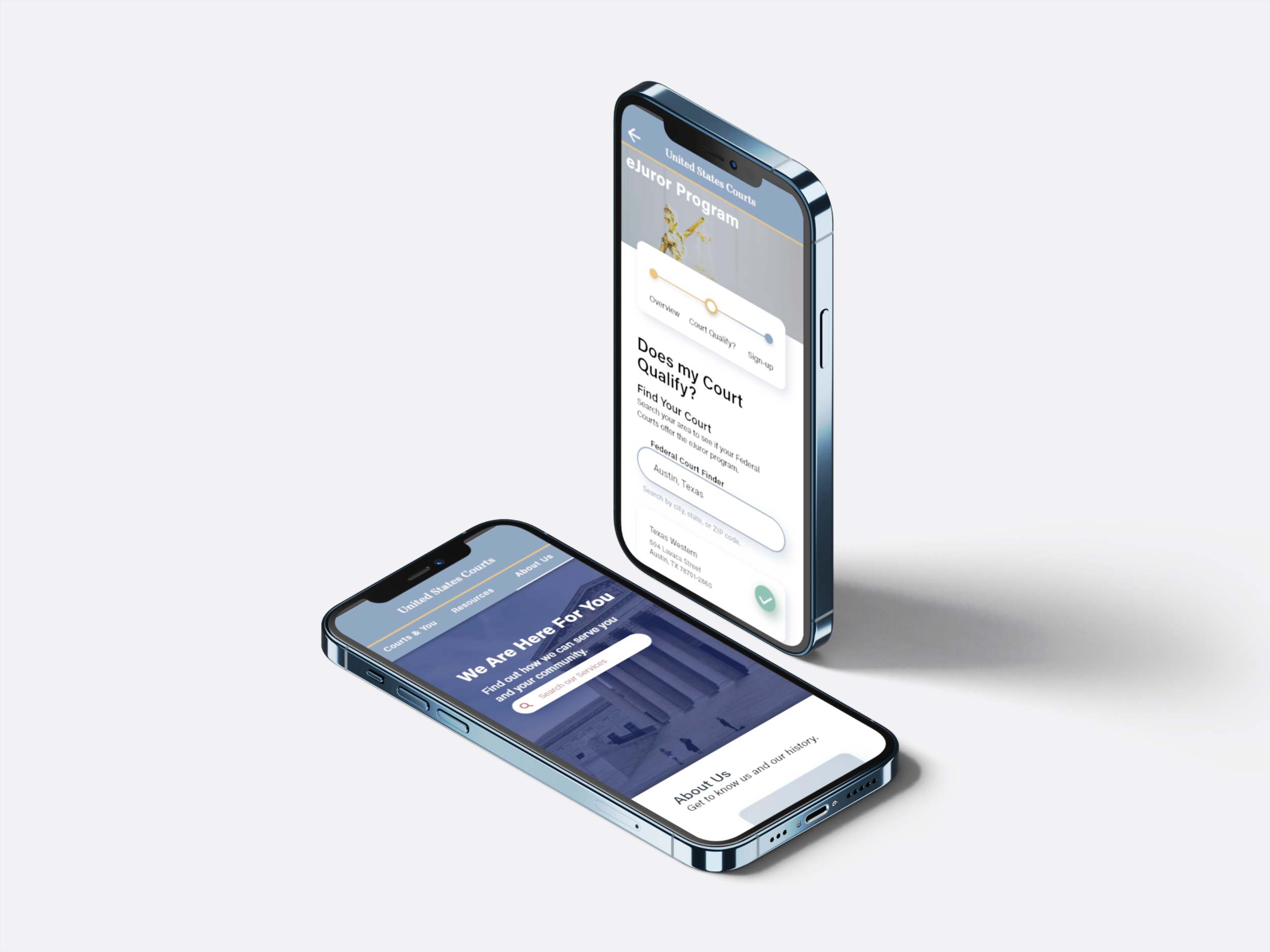
We relied on a progress bar to indicate the amount of steps, so that users could feel they were working towards completion. Additionally, we realized that users felt being redirect to find your court was to tedious, so we moved that into the eJuror page.
4
User Flow Changes
Don't force users to another websites. Instead, we attempted to connect the sites as much as possible.

Develop & Design
Now that we have a deep understanding of our problem, we dug into the solutions.
Wireframing
Style Guide
Usability Testing
Analysis
Iteration
Wireframes
After our criteria was set, we started working on our possible solutions. As always, there are multiple ways to fix any problem, but we selected the few that felt right for us. Below is a look into our design process.
Style Guide
While creating this site, I added design elements that conveyed a sense of professionalism, and, simultaneously, a friendly. An example of these juxtaposing sensations existing in harmony, is the color scheme that is both has trusting and reliable blues, but also a pop of gold.

Final Prototype
Prototype time! Below are all the deliverables from the design phase with explanations.
Before & After
Final Iteration
Responsive Design
Final Thoughts
Future Ideas
Before & After
Here is the before and after. Let’s breakdown the differences and why they matter.
Is the purpose of the site clear?
A site that is for everyone is sometimes for no one. This site demonstrates that it’s having problems catering to every need and crammed everything onto one website. One way you can notice is all the buttons and navigation - everything from Statistics & Reports to Jury Service to the History of the Courts are presented.
What is the Content Strategy?
We all know that Content Strategy matters. The Federal Courts have one homepage, so it might not be the best use of space to have their YouTube videos on the homepage. With such limited views, this and other items could be placed in another section of the site.
Let’s talk about Navigation…
Navigation options are great and show that this site is ready to be explored. However, that could be overwhelming for users that are already stressed. For example, if you are filling a set of Bankruptcy forms and are already overwhelmed by financial stress, you might have the emotional capacity to parse through so much information.
Is the purpose of the site clear?
A site is solely for the general public. When looking at all the information stored on the site and my goal of connecting the public to the Federal Courts, I decided that the Federal Courts site could be reimaged to be only for the public. This would require that Judges, Lawyers, have their own portal/site.
What is the Content Strategy?
Here we are just focused on getting users the information they need. Whether you are searching through the navigation bar or manually checking the cards, I wanted to guide users to the right source.
Let’s talk about Navigation…
Navigation here is consistent. Same cards. Same look. So that users can feel comfortable knowing that there are no hidden surprises around the next corner/next page.
U.S. Federal Court Prototype Walk Through
Below is a video that will walk you through the hi-fi mobile prototype.
Final Thoughts
The Federal Judicial system is complicated - From the large volume of information being hosted to various multiple-step programs that anyone could easily get lost in.
This project was an attempt to remove barriers for every user, so we could fulfill the very human need to be heard.
However, along the way, we encounter our own pitfalls.
The pandemic had just begun and we were all dealing with a rollercoaster of emotions.
My team was cut short halfway through the project and I had to adjust to a different team dynamic.
This site contained too much information and we often felt overwhelmed redesigning the information architecture.
We had to learn how to be quickly adjusted to new environments and teams, and manage complexities.
We did all that with the hopes that through technology, we could work together to connect the community to our institution. So that hopefully, we could hear the needs of the people - all the people.
Future Iteration
Improve the typography
Make the site more accessible. Every voice needs to be heard and I want to find ways to include everyone and I mean everyone.
Create U.S. Federal employee section
Get more feedback from law experts.
Conduct more test on final prototype.


